Make Way for Data Visualization
Wednesday, October 6, 2010
Your question then, of course, must be "What is data visualization?"

According to Calabrese, a data visualization is a visual representation of information that comes in the form of a motion chart, an interactive dashboard, a timeline, and many other things.
Journalist can use data visualization to tell stories or present information in a way that will draw viewers in and, in some cases, awe them. Statistics become more interesting; ideas become easier to understand.
For example, Journalist Latoya Egwuekwe wanted to show how the Recession has affected employment in the United States. Her choice to use data visualization in The Geography of a Recession put her in national headlines.

If you didn't understand the country's unemployment rate before viewing her visualization, you will after.
Furthermore, data visualization has the ability to make figures that may be confusing- such as the nation's spending- easier to comprehend.
In his visualization entitled The Billion Dollar-O-Gram, David McCandless provides an easy-to-understand visualization that shows viewers where the United States is spending it's money.
One visualization I found intriguing was from Randall Munroe- who is the author of a "XKCD," "A Webcomic of Romance, Sarcasm, Math and Language."
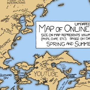
Munroe's data visualization called Online Communities 2 shows social media sites in the form of land masses: Facebook takes up most of Asia and includes the "Northern Wasteland of Unread Updates."
As bloggers, we must remember that presenting our information in the fastest and easiest way is of the utmost importance. We want our readings to enjoy what they are viewing.
Data visualization takes confusing statistics and shows them in a new light and morphs fun facts into amazing visuals.